Evaluation Results
This page presents the results of our usability testing conducted with real users. The evaluation includes demographic data, task completion metrics, usability scores, and qualitative feedback. In total we had 7 users that were willing to give us some feedback and test the app before final evaluation.
Demographics
Age Distribution
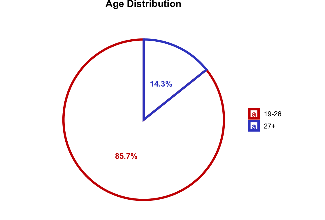
The chart shows the age distribution of our test participants, helping us understand which age groups were represented in our testing.
Occupation Distribution
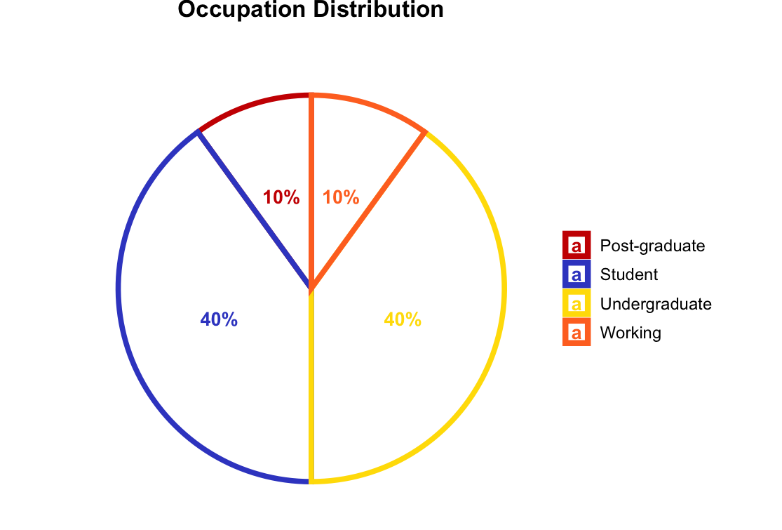
Distribution of participant occupations, providing context about the backgrounds of our test users.
Pokemon Familiarity
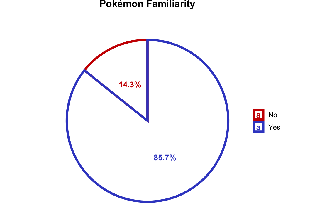
This visualization shows participants’ familiarity levels with Pokemon, which helps contextualize their interactions with the app.
Task Performance
Task Completion Success Rate
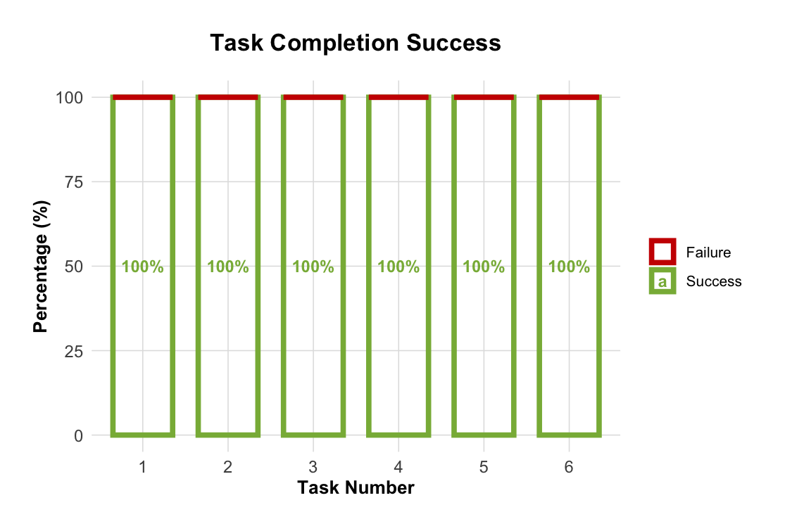
Stacked area chart showing the success rate for each task. The x-axis represents individual tasks while the y-axis shows the completion rate, allowing us to identify which features were most intuitive.
Single Ease Question (SEQ) Scores
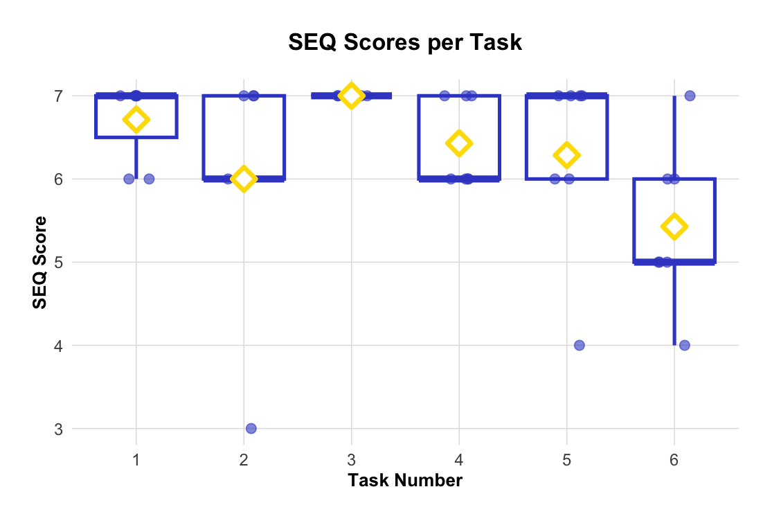
Boxplot visualization of SEQ scores for each task, measuring perceived difficulty on a scale from 1 (very difficult) to 7 (very easy). Higher scores indicate better usability. In our case, we managed to score a pretty good performance even if we
Overall Usability
System Usability Scale (SUS)
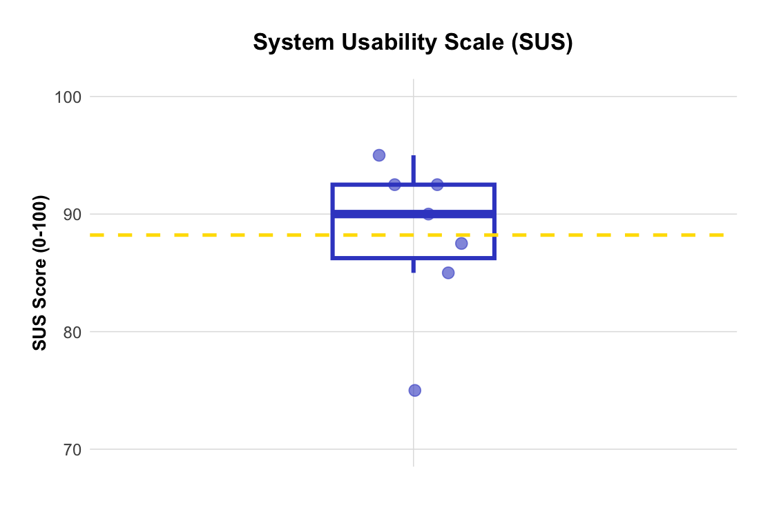
Distribution of System Usability Scale scores across all participants. SUS scores above 68 are considered above average, with scores above 80 indicating excellent usability. In our case we have an average SUS-Score of 88.2 which shows excellent usability.
Qualitative Feedback
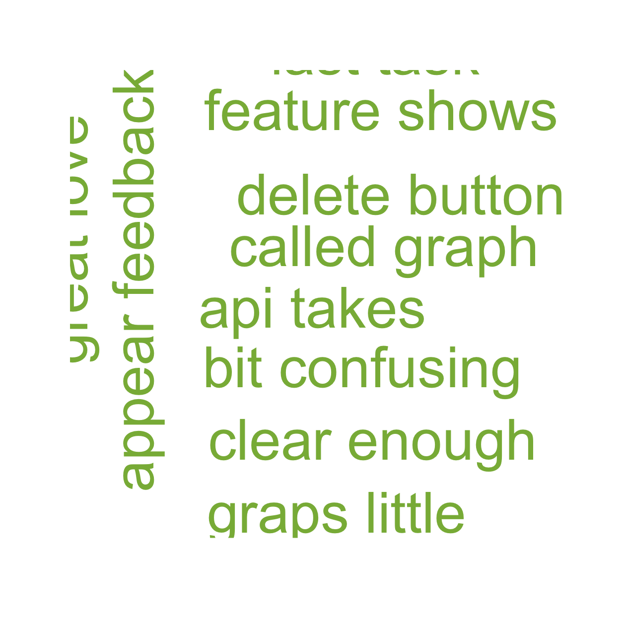
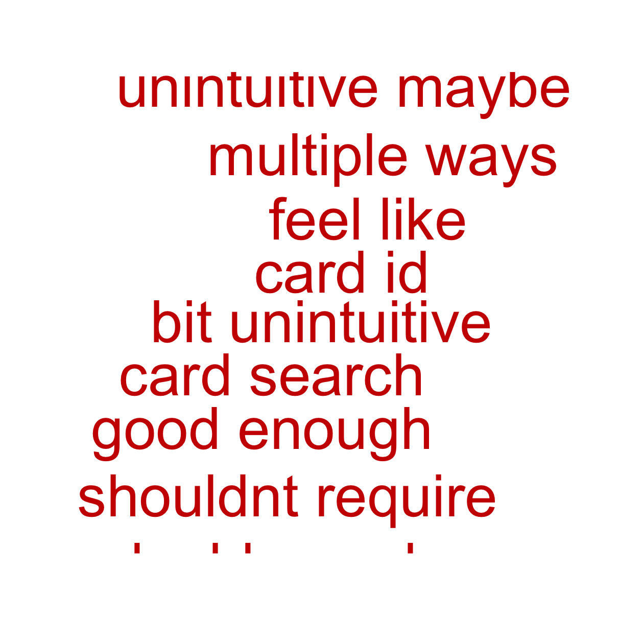
User Feedback Word Cloud
Positive / Neutral
Negative
Suggestion
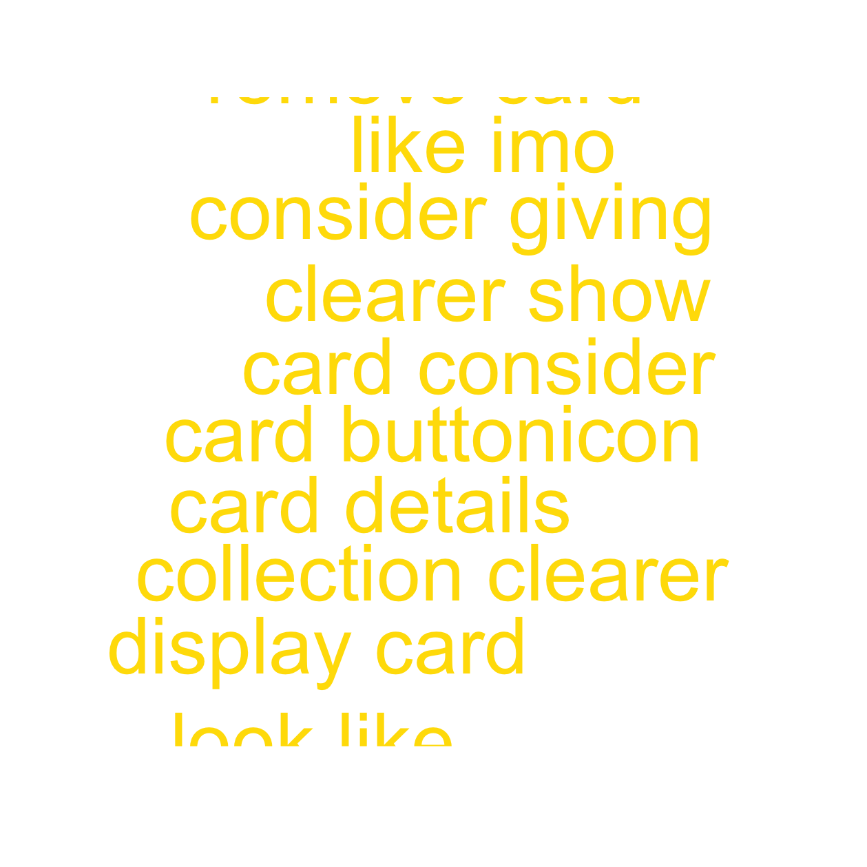
Word cloud visualization of common themes and keywords from user feedback, highlighting the most frequently mentioned terms in participant responses. In this case we have a positive/neutral word cloud, a negative word cloud and a word cloud of suggestions. This makes it easier to see where excitements happen and where the shoe gets pressed
Feedback Summary
| Theme | Type | Mentions |
| Ease of Use | Negative | 1 |
| Ease of Use | Positive/Neutral | 5 |
| Ease of Use | Suggestion | 1 |
| Functionality | Negative | 4 |
| Functionality | Positive/Neutral | 7 |
| Functionality | Suggestion | 4 |
| Interface Design | Negative | 1 |
| Interface Design | Positive/Neutral | 6 |
| Interface Design | Suggestion | 2 |
Detailed summary of qualitative feedback, organized by themes and user comments.
Key Insights
Based on the evaluation results:
- Strengths: Tasks with high completion rates and positive SEQ scores
- Areas for Improvement: Features with lower scores or user frustrations
- User Preferences: Most appreciated features from qualitative feedback
- Priority Issues: Critical usability problems identified through testing
Improvements after the feedback
Based on the feedback we have received, we:
- moved the “Recently Added” box to the Collectiond tab, since its where most of the users were looking for it
- made the delete button more visible when deleting cards, since people were confused upon seeing it
- made the cards in the grid of “Most Valuable” & “Recently Added” clickable, and being able to see its further details